

Best 10 Saree for Office Wear AI Prompts for Professional Sophistication
Office saree portraits are tricky. You want polish, but not stiffness. You want a pastel palette that reads calm on a screen, but you also want a pose that looks like a real person standing in a real room. This collection of ten prompts solves that by keeping the wardrobe specific and the lighting soft. Each card names a fabric, a color story, and a gesture, so the model has something concrete to hold onto instead of drifting into generic glamour.
Below you will find a single walkthrough for the whole set. The cards range from Sophisticated Simplicity: Indian Woman with a Minimalist Pendant to Playful Grace: Indian Woman with a Flowing Dupatta, and they share one mood: professional sophistication without losing warmth. Read the sections in order, or jump to the tools and issues tables if you already have a favorite card.
What this office saree prompt collection is asking for
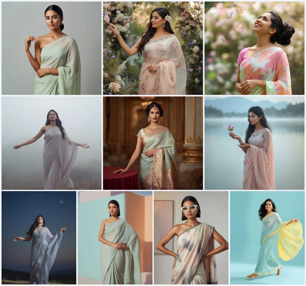
Every card in this set builds a full-body portrait of an Indian woman in a pastel saree, and the details repeat in a way that makes the collection feel like one shoot rather than ten unrelated images. The recurring choices are deliberate: soft fabrics, calm backgrounds, and hands that do something small and believable.
- A named fabric and color, such as plain pastel georgette in soft mint green, pastel floral embroidered organza, luxurious pastel Banarasi silk with gold Zari motifs, crisp pastel linen, or sheer pastel chiffon.
- A full-body pose with a specific gesture, like one hand showcasing a delicate silver pendant or playfully sweeping a flowing dupatta outwards.
- A calm expression described as serene, poised, confident, gentle, or bright and cheerful, never blank.
- Makeup that matches the mood, from minimalist with a natural pink lip to a contemporary look with soft graphic liner and a matte nude lip.
- Hair with a fixed shape, such as a polished low bun, a chic textured ponytail, soft romantic waves, or a sharp asymmetrical bob.
- A background that stays quiet, whether a clean plain pastel studio, a minimalist architectural structure, or a blurred pastel garden scene.
Where each portrait actually takes place
The scenes split into three families. The first is studio-clean, where a card says the background is a clean, plain pastel surface and the light is soft and even. The second is architectural, where the subject stands in front of a minimalist architectural structure composed of large, intersecting pastel-colored blocks, which gives the frame straight lines behind a soft figure. The third is outdoor and atmospheric, from a beautifully curated garden to a vast, misty landscape and a secluded hilltop under a vast, starry sky.
The gestures are what keep these scenes from feeling like stock photos. One card has her standing upright with one hand gently showcasing a delicate, minimalist silver pendant necklace, while the other rests gracefully near her waist. Another shows her gracefully reaches out to touch a flower, her other hand holding her saree. A third places her in a full-body walking pose, playfully sweeping her flowing dupatta outwards with one hand, creating a soft, dynamic motion. Because the action is named, the model has a clear target and the result reads as a captured moment.
Why this set works for professional portraits
These prompts are built around restraint, and that is exactly what office-adjacent portraits need. Pastel georgette, linen, and crepe read as modern and approachable, while Banarasi silk with gold Zari motifs adds authority when you want it. The lighting notes stay soft and diffused, which flatters skin and keeps the fabric texture visible instead of blowing it out. The gestures are small and professional, so the image feels composed rather than theatrical. Finally, the variety inside one collection means you can post a calm minimalist frame, a confident architectural frame, and a joyful outdoor frame without the feed looking repetitive.
- Pastel fabrics and soft diffused light keep the tone professional and calm.
- Named gestures give the pose purpose, which reads as confidence rather than posing.
- Ten distinct cards share one visual language, so a set looks intentional together.
Three style directions inside this collection
There are three clear style directions you can lean into when you generate from this set, and each one stays inside the same pastel, full-body, professional frame.
- Minimalist studio: Pick the cards with plain pastel georgette, a polished low bun, and a clean plain background, then keep the makeup subtle and the light even for a quiet, editorial look.
- Architectural modern: Use the linen and crepe cards with geometric patterns, oversized pastel-framed glasses, and a sharp asymmetrical bob, letting the minimalist architectural structure carry the composition.
- Ethereal pastel: Follow the chiffon and organza cards into misty landscapes, lakesides, and pastel gardens, where soft romantic waves and a blurred pastel backdrop create atmosphere without losing the saree.
How to run these prompts step by step
Work through the cards one at a time rather than pasting all ten at once, because each one has its own fabric, gesture, and background. Keep a notes file with the color words so you can reuse a palette you like across a second image.
- Copy the prompt. Open the card you want and copy the full text exactly, including the fabric, the pose, and the background sentence.
- Upload a reference. Add one clear reference photo of the person or the saree drape so the model has a real anchor for face shape and fabric fall.
- Generate a first pass. Run the prompt unchanged at a full-body aspect ratio, then look at the overall silhouette before you judge the small details.
- Check the hands. Zoom in on the hand holding the pendant, the saree pleat, the lotus flower, or the dupatta, and regenerate if fingers merge or the grip looks wrong.
- Check the face. Confirm the expression matches the card, whether that is a soft graceful smile, a wide infectious smile, or a poised and direct gaze.
- Check the main object. Verify the silver pendant, the embroidered blossoms, the gold Zari motifs, or the pastel-framed glasses are sharp and correctly placed.
Choosing the reference photo
The reference photo does more work than most people expect, especially when the prompt asks for a specific drape and a specific gesture. A clean, well-lit image gives the model enough information to keep the saree believable.
- Use a full-body or three-quarter shot in even light so the pallu, pleats, and waistline are all readable.
- Keep the background plain in the reference, since the prompt already supplies a garden, a palace room, or a pastel studio and two busy backgrounds will fight.
- Avoid heavy filters on the reference, because the prompt defines its own makeup and skin finish and a filtered source can drag the result away from the pastel palette.
Which tool to use for these cards
All four tools handle a full-body pastel portrait, but they differ in how much control you get over fabric and hands. Match the tool to the card you care about most.
| Tool | Access | Typical realism | Useful here for |
|---|---|---|---|
| ChatGPT | Web and app, paid tiers for image generation | Good for composition, softer on fine textile detail | Drafting the full-body pose and checking that the delicate silver pendant necklace sits in the right hand. |
| Google Gemini | Web and app, generous free tier | Strong on scene mood and color accuracy | Nailing the soft gradient of misty grey and pale lavender in the ethereal landscape card. |
| Leonardo AI | Web, free daily credits | High control over pose and lighting | Locking the full-body walking pose so the flowing dupatta sweeps outward without warping. |
| Midjourney | Discord and web, paid subscription | Highest overall realism and fabric texture | Rendering the intricately woven gold Zari motifs on the pastel Banarasi silk saree. |
Small adjustments that improve these portraits
Once the base image works, a few targeted tweaks push it from good to usable for a professional profile or a calm social post.
- If the pastel georgette reads too flat, add one sentence about soft diffused light catching the fabric folds so the drape gains depth.
- When the gold Zari motifs blur, generate again at a higher resolution before you touch anything else, because upscaling a soft weave rarely recovers it.
- If the pastel-framed glasses look painted on, ask for a slight reflection on the lens so the accessory sits on the face instead of over it.
Common failures and what to change
These are the failures this collection actually produces, and each one has a specific fix rather than a vague instruction to try again.
| Issue | What to change |
|---|---|
| Hands merge around the pendant or the saree pleat | Add a line naming the hand position, such as one hand gently showcasing the pendant, and regenerate before editing. |
| The pastel palette turns muddy or grey | Reinforce the named colors, for example soft mint green and pale pink, and remove any word that suggests heavy shadow. |
| The saree drape loses its pleats and pallu | State the fabric again, such as plain pastel georgette or sheer pastel chiffon, and ask for a full-body frame so the drape has room. |
| The background competes with the subject | Simplify the background sentence to a clean, plain pastel surface or a blurred pastel garden scene and drop extra props. |
Frequently Asked Questions
Can I use one reference photo for all ten cards?
Yes, as long as it is a clean full-body or three-quarter shot in even light. The cards change the saree, the gesture, and the background, so a neutral reference keeps the person consistent while the wardrobe and scene shift around her.
Which card is easiest for a first attempt?
Start with Sophisticated Simplicity: Indian Woman with a Minimalist Pendant. The plain pastel georgette, the clean background, and the single hand gesture give the model the fewest things to get wrong, so you can judge the tool before moving to busier cards like Garden Bloom or Dreamy Lakeside.
Why do the hands keep failing on the dupatta and lotus cards?
Those cards ask for motion and a held object at the same time, which is the hardest combination. Generate a few variations, then fix the hand in an editor you have the right to use, or add one clear sentence about which hand holds what and try again.
Conclusion
This collection works because it treats professional sophistication as a set of small, specific decisions rather than a single mood word. Pastel georgette, linen, crepe, organza, chiffon, and Banarasi silk each bring a different weight, and the named gestures give every portrait a reason to exist. Pick two or three cards that match the tone you want, keep the palette consistent across them, and check the hands, the face, and the main object before you post. Done that way, the set reads as one calm, confident portfolio instead of ten random images.